Last week, we looked up the use of context within time intelligence and how time intelligence can be used to introduce some of the concepts of context within the Power BI platform. Context is a key part of any Analytics platform, so many of the points mentioned in this article will be of use beyond Power BI, but for simplicity, this article is more about Power BI specifically.
Dates (Calendar) and Time (Clocks) are something that will be across so many modern data sets. If we return to a retail mindset, a sale will be made on a particular day (date) at a specific time (time). As you combine or aggregate those, the context starts to come out. Our board wants to know, “Hey, how many sales did we make yesterday, and how much was the gross profit?” So, Analytically, we are interested in Date level measures. You may have a lower-level question coming from a store manager “What’s the busiest time of day for us?” Exploration of that data requires us to look at time. When we consider what the expected views are the first one is simple, it may be a column chart with each day being the daily sales either “count of sales” or “gross profit”, both of those make sense, we can then further roll that same chart up, so we could have a cumulative monthly figure and plot the same chart with months along the axis. All we have had to do is change the granularity. The contextual difference of a month or a day comes from the calendar held within Power BI. So far so good. Now, what about the lower-level question; when the busiest time is for the business? In order to find this out we would need to look at the specific time of the sale… but that introduces “Granularity”, most systems these days will record time to the 1000th of a second, aggregation at that level equates to spikes when sales are made, so we’ll need to “Normalise” our time values first to establish an appropriate granularity. To keep things simple, we’ll assume a 5-minute granularity that gives lots of detail when needed, although from the perspective of the Store Manager, it may be too detailed. In analysis we must understand the reason for the analysis as much as the how. The reason in this case would more than likely be to determine if shift patterns are optimal. We cannot ask staff to come in for a 5-minute period, so the sensible thing is to find a sensible analysis point. In this situation, hourly would be sensible. The net result is just like in our Calendar when we combine our days together to build a monthly report, we can combine our 5-minute time slices together to build an hourly report. Does this granularity question start to explain why you split dates and times? If we had to roll up our 5-minute slices across days and then months, that would mean having huge swathes of data that returned nothing, after all never selling anything between 09:00 and 09:05 does not mean your business is doing badly. The second reason is because we want to compare the time profile of our data across multiple days or months. “Do we have a consistent usage profile of our store?”
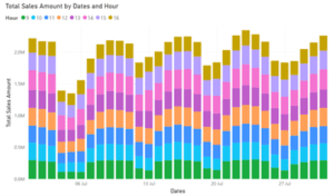
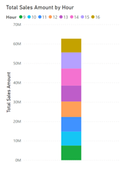
So, what happens is we may well end up with a stacked column chart, where each day of the month is the column and we have the bands as the time periods i.e. 09:00:00 – 09:59:59, 10:00:00 – 10:59:59 and 11:00:00 – 11:59:59. This would give a clear visual representation of how sales break down over time. Having a separate column with that split over the whole month would also show the Mean (Average) performance.


These charts highlight exactly why we need to separate the date and time dimensions; if the two were combined, it would be impossible to combine them in this way. This also starts to highlight why analysis keeps coming back to the Fact and Dimension tables used by both the Kimball Schema (Star Schema) and Inmon (think of this more as a Data Warehousing version of Kimball). Aggregations – Total Sales Amount – are the Facts, while the axes (or legends) are formed from the dimensions – Dates and Hours.
When you perform analysis you are altering the dimensions that the fact is pivoted around – did we just explain the origin of Pivot Tables? Power BI allows for a simple measure to be written and then used across a range of contexts; the interactivity of a Power BI report page means that if you have built a page or different charts, you could click on one area and see that subsection is expressed elsewhere. So “What product did we sell the most of when we were busy?” Click on the busy time and your “Products sold” version of the chart will be filtered to highlight what is being sold.
If you would like to know more about how to get the most out of your organisation’s data and how to get started building all this for yourself don’t hesitate to get in touch with us office@geordieconsulting.co.uk or +44 191 432 7330

